瀑布流原来这么简单
0 / 0 / 创建于 6年前
 hant 的个人博客
实现瀑布流
1. 简介
采用jquery的waterfall插件,下面是waterfall的源码,源码不多,直接贴出来,新建文件复制代码,既可以使用。
(function ($) {
    var $window = $(window), pluginName = 'waterfall', defaults = {
        itemClass: "waterfall-item",
        spacingWidth: 10,
        spacingHeight: 10,
        minColCount: 2,
        resizeable: false,
        itemAlign: "center",
        isFadeIn: true,
        ajaxCallback: null
    };

    function Waterfall(element, options) {
        this.$element = $(element);
        this.options = $.extend(true, {}, defaults, options);
        this.ajaxLoading = false;
        this.colHeightArray = [];
        this._init();
    }

    Waterfall.prototype = {
        constructor: Waterfall, _init: function () {
            var $this = this;
            $window.on("load", function () {
                $this._positionAll();
            });
            if (this.options.resizeable) {
                $window.on("resize", function () {
                    $this._positionAll();
                });
            }
            this._doScroll();
        }, _getColumnCount: function () {
            var parentWidth = this.$element.width(), $item = $(this.options.itemClass),
                itemWidth = $item.eq(0).outerWidth(),
                iCol = Math.floor(parentWidth / (itemWidth + this.options.spacingWidth)), realWidth = 0, leftOffset = 0;
            iCol = iCol > this.options.minColCount ? iCol : this.options.minColCount;
            realWidth = iCol * itemWidth;
            if (parentWidth > realWidth) {
                leftOffset = Math.floor((parentWidth - realWidth - iCol * this.options.spacingWidth) / 2);
            }
            this.itemWidth = itemWidth;
            this.cols = iCol;
            this.leftOffset = this.options.itemAlign == "center" ? leftOffset : 0;
        }, _positionAll: function () {
            var $this = this, $item = $(this.options.itemClass), minHeight, minIndex;
            this._getColumnCount();
            this.colHeightArray = [];
            $item.each(function (index) {
                $(this).css("position", "absolute");
                if (index < $this.cols) {
                    $(this).css("top", 0);
                    $(this).css("left", $this.leftOffset + index * $this.itemWidth + index * $this.options.spacingWidth);
                    $this.colHeightArray.push($(this).outerHeight());
                } else {
                    minHeight = Math.min.apply(null, $this.colHeightArray);
                    minIndex = $.inArray(minHeight, $this.colHeightArray);
                    $(this).css("top", minHeight + $this.options.spacingHeight);
                    $(this).css("left", $item.eq(minIndex).offset().left);
                    $this.colHeightArray[minIndex] += $(this).outerHeight() + $this.options.spacingHeight;
                }
                if ($this.options.isFadeIn) {
                    $(this).animate({"opacity": 1}, 300);
                }
            });
            this.$element.css("height", Math.max.apply(null, $this.colHeightArray));
        }, _doScroll: function () {
            var $this = this, scrollTimer;
            $window.on("scroll", function () {
                if (scrollTimer) {
                    clearTimeout(scrollTimer);
                }
                scrollTimer = setTimeout(function () {
                    var $last = $($this.options.itemClass).last(), scrollTop = $window.scrollTop() + $window.height();
                    if (!$this.ajaxLoading && scrollTop > $last.offset().top + $last.outerHeight() / 2) {
                        $this.ajaxLoading = true;
                        $this.options.ajaxCallback && $this.options.ajaxCallback(function () {
                            $this._positionAll();
                        }, function () {
                            $this.ajaxLoading = false;
                        });
                    }
                }, 100);
            });
        }
    }
    $.fn[pluginName] = function (options) {
        this.each(function () {
            if (!$.data(this, "plugin_" + pluginName)) {
                $.data(this, "plugin_" + pluginName, new Waterfall(this, options));
            }
        });
        return this;
    }
})(jQuery);
2. 使用方法
定义一个放图片的div,注意此时的my_container 就是该容器,该容器初始内容一定要超过屏幕高度,不然没有滚动条,不能触发加载函数。
  <div class="text-center my_container">
        <div class="box">
            <img src="/imgs/detail/top.jpg">
        </div>

        <div class="box">
            <img src="/upload/pic/2019-09-03/1567491229-gOYDHq5y.jpg">
        </div>

        <div class="box">
            <img src="/upload/pic/2019-09-03/1567491229-gOYDHq5y.jpg">
        </div>
        <div class="box">
            <img src="/upload/pic/2019-09-03/1567491401-YJS4RPt1.jpg">
        </div>
    </div>
引用js文件和写js
<script src="/js/waterfall.js"></script>
<script type="text/javascript">
$(".my_container").waterfall({
itemClass: ".box", //img 外层的div类名
minColCount: 1, // 每行最少几个块
spacingHeight: 10, //块之间的间隔高度
resizeable: true, //屏幕大小改变时,块的大小是否可以改变
ajaxCallback: function (success, end) {// 下拉刷新时的行数
var data = {
"data": [
{"src": "/imgs/detail/introduction_us.jpg"}, {"src": "/imgs/detail/introduction_10.jpg"},
{"src": "/imgs/detail/introduction_1.jpg"}, {"src": "/imgs/detail/introduction_5.jpg"},
{"src": "/imgs/detail/introduction_3.jpg"}, {"src": "/imgs/detail/introduction_7.jpg"}
]
}; //data 可以通过ajax请求获取代替,这里为了演示,将数据写死。
var str = "";
var templ = '<div class="box" style="opacity:0;filter:alpha(opacity=0);"><div class="pic"><img src="test" /></div></div>';//只是为了方便添加元素写成这样,可以直接在 用for循环 append()元素。
for (var i = data.data.length - 1; i > 0; i--) {
str += templ.replace("test", data.data[i].src);
}
$(".my_container").append(str);
success();
end();
}
});
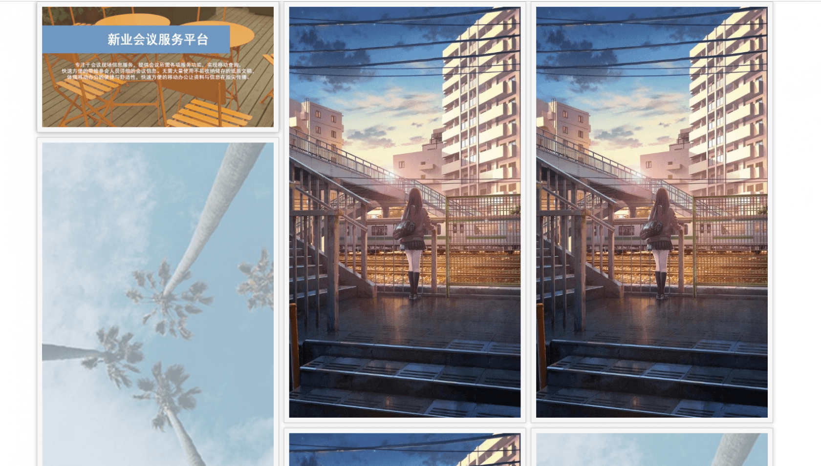
</script>效果
tips 贴一下类样式
<style>
        .my_container {
            margin: auto;
            position: relative;
        }
        @media screen and (max-width: 768px) {
            .my_container {
                width: 100%;
            }
        }
        .box:hover {
            box-shadow: 0 0 10px #999;
        }
        .box img {
            max-width: 100%;
        }
        .box {
            float: left;
            padding: 10px;
            border: 1px solid #ccc;
            background: #f7f7f7;
            box-shadow: 0 0 8px #ccc;
            width: 500px;
        }
        @media screen and (max-width: 768px){
            .box{
                width: 100%;
            }
        }
</style>本作品采用《CC 协议》,转载必须注明作者和本文链接


 关于 LearnKu


 粤公网安备 44030502004330号