React Native 探索(四)Flexbox 布局详解
0 / 0 / 创建于 6年前 /
 NiZerin 的个人博客
前言
在 Android 开发中我们有很多种布局,比如 LinearLayout 和 RelativeLayout,同样在 React Native 也有它的布局,这个布局就是 Flexbox 布局。在 CSS、React Native 和 Android 等都有它的身影。这一篇文章,我们就通过各种小例子来掌握 React Native 中的 Flexbox 布局。
1.Flexbox布局概述
Flexbox 译为弹性布局(这里我们简称Flex),是 CSS 的一种布局方案,可以简单、完整、响应式的实现各种页面布局。不只是在 CSS 中应用,在 React Native 也使用了 Flex,基本和 CSS 中的 Flex 类似。甚至在 Android 开发中我们也会用到 Flex,谷歌提供了基于 Flex 的FlexboxLayout,以便于处理复杂的布局,因此,学习 Flex 布局对于 Android 开发也是有帮助的。
采用 Flex 布局的元素,称为 Flex 容器(flex container),简称容器,它的所有子元素则是 Flex 容器的成员称为 Flex 项目(flex item),简称项目。如下图所示。
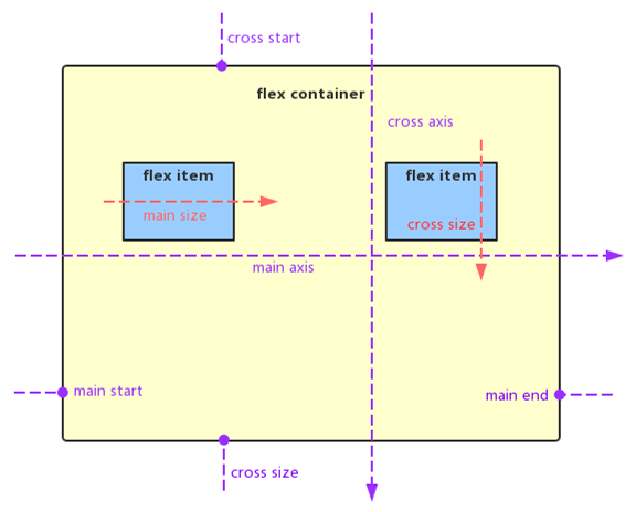
容器默认存在两根轴:水平的主轴(main axis)和垂直的交叉轴(cross axis)。主轴的开始位置叫做 main start,结束位置叫做 main end。相似的,交叉轴的开始位置叫做 cross start,结束位置叫做 cross end。项目默认沿主轴排列,它在主轴上的长度叫做 main size,交叉轴上的长度叫做 cross size。
2.Flexbox容器属性
在CSS(React)中容器属性有6种,而在 React Native 中容器属性有5种,它们分别是:
- flexDirection
- justifyContent
- alignItems
- alignContent
- flexWrap
下面通过小例子来分别介绍这些 Flexbox 容器属性。
flexDirection
flexDirection 属性可以决定主轴的方向(即项目的排列方向),它有以下取值:
- column(默认值):主轴为垂直方向,起点在顶端。
- row:主轴为水平方向,起点在左端。
- column-reverse:主轴为垂直方向,起点在下端。
- row-reverse:主轴为水平方向,起点在右端。
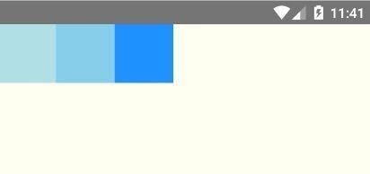
我们先将 flexDirection 设置为row,代码如下所示。
import React, {Component} from 'react';
import {AppRegistry, View} from 'react-native';
class FlexDirection extends Component {
render() {
return (
<View style={{flex: 1, flexDirection: 'row', backgroundColor: 'ivory'}}>
<View style={{width: 60, height: 60, backgroundColor: 'powderblue'}}/>
<View style={{width: 60, height: 60, backgroundColor: 'skyblue'}}/>
<View style={{width: 60, height: 60, backgroundColor: 'dodgerblue'}}/>
</View>
);
}
}
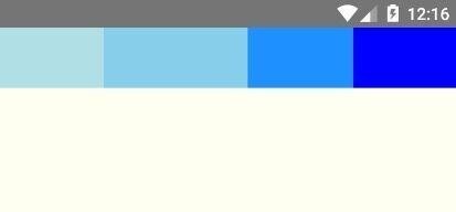
AppRegistry.registerComponent('AwesomeProject', () => FlexDirection);运行效果如下图所示。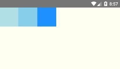
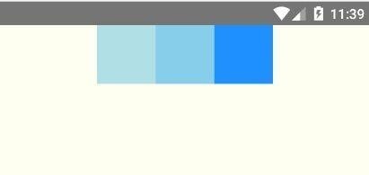
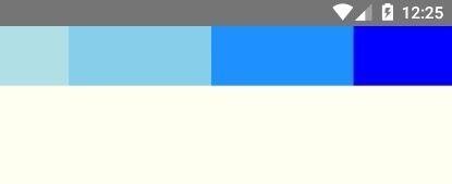
可以看出项目(子组件)是水平排列的,并且起点在左端。关于例子中的颜色设定可以查看官网文档。我们也可以将flexDirection设置为row-reverse,来查看效果: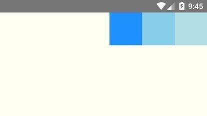
可以看出Flex项目同样是水平排列的,只是起点在右端。
justifyContent
justifyContent 属性用于定义项目在主轴上的对齐方式。它的取值有以下几种:
- flex-start(默认值):项目与父容器在主轴的起点方向对齐。(比如flexDirection等于row时,项目与父容器左端对齐)
- flex-end:项目与父容器在主轴的终点方向对齐(比如flexDirection等于row时,项目与父容器右端对齐)。
- center:居中。
- space-between: 两端对齐,并且项目间隔相等。
- space-around:每个项目的两侧间隔相等,因此,项目之间的间隔是项目与父容器边缘间隔的2倍。
我们将 justifyContent 设置为flex-end,代码如下所示。
import React, {Component} from 'react';
import {AppRegistry, View} from 'react-native';
class FlexDirection extends Component {
    render() {
        return (
            <View style={{flex: 1, flexDirection: 'row', justifyContent: 'flex-end',
            backgroundColor: 'ivory'}}>
                <View style={{width: 60, height: 60, backgroundColor: 'powderblue'}}/>
                <View style={{width: 60, height: 60, backgroundColor: 'skyblue'}}/>
                <View style={{width: 60, height: 60, backgroundColor: 'dodgerblue'}}/>
            </View>
        );
    }
}
AppRegistry.registerComponent('AwesomeProject', () => FlexDirection);
效果如下所示。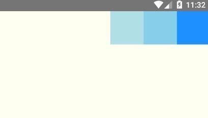
接下来我们分别设置 justifyContent 为flex-start和center,效果分别如下所示。
接下来我们分别设置 justifyContent 为space-between和space-around来查看它们有什么区别,效果分别如下所示。
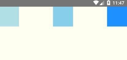
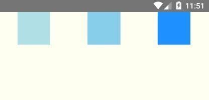
上面左图是设置了 space-between,可以看出最左边和最右边的项目都和父容器没有间隔,并且项目之间的间隔是相等的。右图的是 space-around,最左边和最右边的项目都和父容器有间隔,并且项目之间的间隔是项目与父容器的间隔的2倍。
alignItems
alignItems 用于定义项目在交叉轴上的对齐方式。它的取值有以下几种:
- flex-start:项目与父容器在交叉轴的起点方向对齐。(比如flexDirection等于row时,项目与父容器上端对齐)
- flex-end:项目与父容器在交叉轴的终点方向对齐。(比如flexDirection等于row时,项目与父容器下端对齐)
- center:居中。
- baseline :项目的第一行文字的基线对齐。
- stretch:(默认值)如果项目未设置高度或者高度设为auto,项目将占满整个容器的高度,否则该取值不会生效。
将 alignItems 设置为flex-end,代码如下所示。
import React, {Component} from 'react';
import {AppRegistry, View} from 'react-native';
class FlexDirection extends Component {
    render() {
        return (
            <View style={{
                flex: 1,
                flexDirection: 'row',
                justifyContent: 'center',
                alignItems: 'flex-end',
                backgroundColor: 'ivory'
            }}>
                <View style={{width: 60, height: 60, backgroundColor: 'powderblue'}}/>
                <View style={{width: 60, height: 60, backgroundColor: 'skyblue'}}/>
                <View style={{width: 60, height: 60, backgroundColor: 'dodgerblue'}}/>
            </View>
        );
    }
}
AppRegistry.registerComponent('AwesomeProject', () => FlexDirection);
效果如下图所示。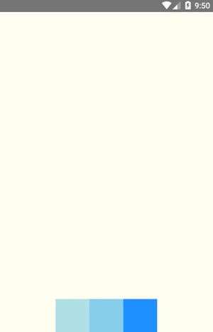
看到 flex-end 的效果,flex-start 和 center 的效果也很容易知道。我们接下来将 alignItems 设置为stretch,需要注意的是,当项目没有设置高度或者高度设为 aut 时, stretch 才会生效。这里为了验证效果,将所有项目的高度设置为 auto 。
import React, {Component} from 'react';
import {AppRegistry, View} from 'react-native';
class FlexDirection extends Component {
    render() {
        return (
            <View style={{
                flex: 1,
                flexDirection: 'row',
                justifyContent: 'center',
                alignItems: 'stretch',
                backgroundColor: 'ivory'
            }}>
                <View style={{width: 60, height: 'auto', backgroundColor: 'powderblue'}}/>
                <View style={{width: 60, height: 'auto', backgroundColor: 'skyblue'}}/>
                <View style={{width: 60, height: 'auto', backgroundColor: 'dodgerblue'}}/>
            </View>
        );
    }
}
AppRegistry.registerComponent('AwesomeProject', () => FlexDirection);
效果如下图所示。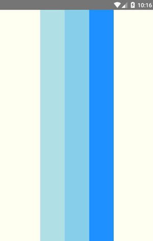
可以看出,当 alignItems 设置为 stretch 时,项目会占满整个容器的高度。
alignContent
alignContent 用于多行项目在交叉轴上的对齐方式。如果项目只有一行,该属性是不起作用的。它的取值有 flex-start 、flex-end 、 center 、space-between 、 space-around 和 stretch,只比 justifyContent 的取值多了一个 stretch(默认值,含义和 alignItems 的stretch 类似),alignContent 的取值的含义和 justifyContent 的取值的含义类似,这里就不做举例了。
flexWrap
flexWrap 用于设置如果一行排不下,如何换行。它的取值有以下几种:
- nowrap(默认):不换行。
- wrap:换行,第一行在上方。
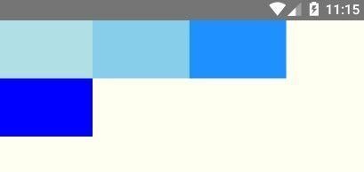
我们将 flexWrap 设置为wrap,代码如下所示。
import React, {Component} from 'react';
import {AppRegistry, View} from 'react-native';
class FlexDirection extends Component {
    render() {
        return (
            <View style={{
                flex: 1,
                flexDirection: 'row',
                alignItems: 'flex-start',
                flexWrap: 'wrap',
                backgroundColor: 'ivory'
            }}>
                <View style={{width: 100, height: 60, backgroundColor: 'powderblue'}}/>
                <View style={{width: 100, height: 60, backgroundColor: 'skyblue'}}/>
                <View style={{width: 100, height: 60, backgroundColor: 'dodgerblue'}}/>
                <View style={{width: 100, height: 60, backgroundColor: 'blue'}}/>
            </View>
        );
    }
}
AppRegistry.registerComponent('AwesomeProject', () => FlexDirection);
效果如下所示。
3.Flexbox项目属性
在 React Native 中项目属性有很多中,具体的可以参考:Layout Props。这里介绍 flexGrow、flexShrink、flexBasis、flex和alignSelf。
flexGrow
flexGrow 属性定义项目的放大比例,默认为0,即如果存在剩余空间,也不放大。
import React, {Component} from 'react';
import {AppRegistry, View} from 'react-native';
class FlexDirection extends Component {
    render() {
        return (
            <View style={{
                flex: 1,
                flexDirection: 'row',
                alignItems: 'flex-start',
                backgroundColor: 'ivory'
            }}>
                <View style={{width: 50, height: 50, flexGrow: 1, backgroundColor: 'powderblue'}}/>
                <View style={{width: 50, height: 50, flexGrow: 2, backgroundColor: 'skyblue'}}/>
                <View style={{width: 50, height: 50, flexGrow: 1, backgroundColor: 'dodgerblue'}}/>
            </View>
        );
    }
}
AppRegistry.registerComponent('AwesomeProject', () => FlexDirection);
我们将第二个项目 flexGrow 设置为2,其他的项目 flexGrow 设置为1,这样第二个项目所占的剩余空间是其他项目的两倍。如下图所示。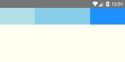
flexShrink
flexShrink 属性定义了项目的缩小比例,默认为1,即如果空间不足,该项目将缩小。
import React, {Component} from 'react';
import {AppRegistry, View} from 'react-native';
class FlexDirection extends Component {
    render() {
        return (
            <View style={{
                flex: 1,
                flexDirection: 'row',
                alignItems: 'flex-start',
                backgroundColor: 'ivory'
            }}>
                <View style={{width: 120, height: 50, flexShrink: 1, backgroundColor: 'powderblue'}}/>
                <View style={{width: 120, height: 50, flexShrink: 0, backgroundColor: 'skyblue'}}/>
                <View style={{width: 120, height: 50, flexShrink: 1, backgroundColor: 'dodgerblue'}}/>
                <View style={{width: 120, height: 50, flexShrink: 1, backgroundColor: 'blue'}}/>
            </View>
        );
    }
}
AppRegistry.registerComponent('AwesomeProject', () => FlexDirection);
我们将第二个项目的 flexShrink 设置为0,其他的项目都为1,这样当空间不足时,第二个项目不会缩小,如下图所示。
flexBasis
flexBasis 属性定义了项目的初始宽度。它的默认值为 auto,即项目的本来的宽度。我们知道 width 也可以用来设置项目的宽度,如果项目同时设置了 width 和 flexBasis,那么 flexBasis 会覆盖 width 的值。
import React, {Component} from 'react';
import {AppRegistry, View} from 'react-native';
class FlexDirection extends Component {
    render() {
        return (
            <View style={{
                flex: 1,
                flexDirection: 'row',
                alignItems: 'flex-start',
                backgroundColor: 'ivory'
            }}>
                <View style={{width: 120, height: 50, flexBasis: 60, backgroundColor: 'powderblue'}}/>
                <View style={{width: 120, height: 50, backgroundColor: 'skyblue'}}/>
                <View style={{width: 120, height: 50, backgroundColor: 'dodgerblue'}}/>
                <View style={{width: 120, height: 50, backgroundColor: 'blue'}}/>
            </View>
        );
    }
}
AppRegistry.registerComponent('AwesomeProject', () => FlexDirection);
效果如下图所示。
flex
如果我们每次都要设定 flex-grow、flex-shrink 和 flex-basis 属性,显然有些麻烦,这时我们可以用 flex 属性,它是 flex-grow、flex-shrink 和 flex-basis 属性的简写属性,默认值为0 1 auto,其中后两个属性可选。关于 flex 这里就不做举例了。
alignSelf
alignSelf 属性和 alignItems 属性类似,只不过 alignSelf 作用于项目,它允许单个项目有与其他项目不一样的对齐方式,并且覆盖 alignItems 属性。alignSelf 默认值为为 auto,表示继承父元素的 alignItems 属性,如果没有父元素,则等同于 stretch。alignSelf 有五种取值:auto、flex-start、flex-end、center、baseline 和 stretch,除了多了 auto ,其他的取值都和 alignItems 的取值含义一样。
import React, {Component} from 'react';
import {AppRegistry, View} from 'react-native';
class FlexDirection extends Component {
    render() {
        return (
            <View style={{
                flex: 1,
                flexDirection: 'row',
                alignItems: 'flex-start',
                backgroundColor: 'ivory'
            }}>
                <View style={{width: 60, height: 60, alignSelf: 'flex-end', backgroundColor: 'powderblue'}}/>
                <View style={{width: 60, height: 60, alignSelf: 'center', backgroundColor: 'skyblue'}}/>
                <View style={{width: 60, height: 'auto', alignSelf: 'stretch', backgroundColor: 'dodgerblue'}}/>
                <View style={{width: 60, height: 60, alignSelf: 'auto', backgroundColor: 'blue'}}/>
            </View>
        );
    }
}
AppRegistry.registerComponent('AwesomeProject', () => FlexDirection);
运行效果如下所示。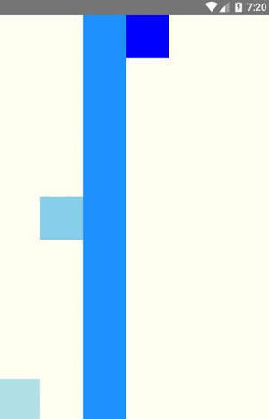
好了,关于 Flexbox 布局就讲到这,还有很多属性这里没有提到,比如:margin、padding、marginRight 和 maxWidth 等等,这些属性我们一看名字就知道它的作用(Android 开发者角度),因此这里就不多介绍了,更多的属性请查阅官方文档。
本作品采用《CC 协议》,转载必须注明作者和本文链接


 关于 LearnKu


 粤公网安备 44030502004330号