
在 Jupyter Notebook 中使用 seaborn 画热力图时展示不完全
在使用 Jupyter Notebook 绘制 heatmap 过程中,出现绘制图形展示不完全的问题。
代码如下 ~ 来源于 seaborn 官方示例:
import matplotlib.pyplot as plt
import seaborn as sns
sns.set()

%matplotlib inline

# Load the example flights dataset and conver to long-form
flights_long = sns.load_dataset("flights")
flights = flights_long.pivot("month", "year", "passengers")

# Draw a heatmap with the numeric values in each cell
f, ax = plt.subplots(figsize=(9, 6))
sns.heatmap(flights, annot=True, fmt="d", linewidths=.5, ax=ax)
获得的示例图形如下:
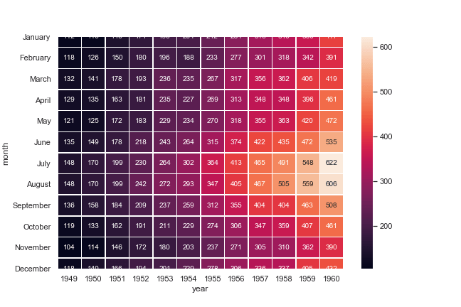
存在的问题为底部和顶部图形呈现不完整,而当我在本地使用 IPython 进行绘图时并没有出现这个问题。
麻烦大佬解释下可能存在的原因以及解决方法,谢谢。


 关于 LearnKu


不是你程序的问题, 是因为matplotlib版本的问题, 你的版本可能是3.1.1, 改回3.1.0就可以了
pip install matplotlib==3.1.0