
x/y轴数据很多,怎么画优雅清晰的折线图
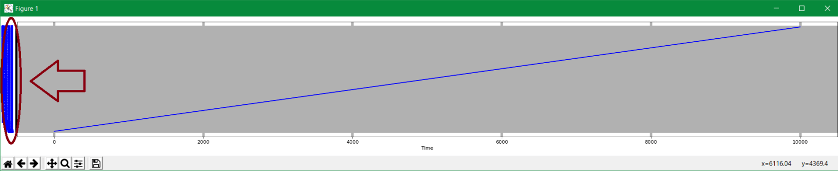
- x,y轴数据比较多,几千个,使用matplotlib绘制折线图后,坐标数据都重叠在一起了,如何是的坐标轴数据清晰不重叠呢
- 以下是我的代码
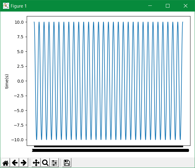
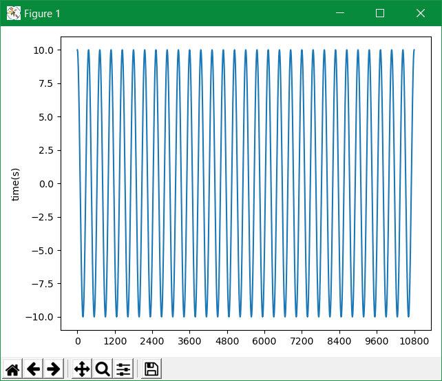
def test_plots(time, time_list): a1 = pl.subplot(311) # a1.set_title("间隔") a1.set_ylabel("time(s)") a1.plot(time, time_list) pl.tight_layout() pl.show() - 生成效果(x轴是时间,数据很多)


 关于 LearnKu


推荐文章: