
Plotly图形和表格混合显示无法修改坐标轴范围
如下图形我用fig.update_layout(yaxis_range=[-3,3])设置y轴坐标范围为啥无法生效??
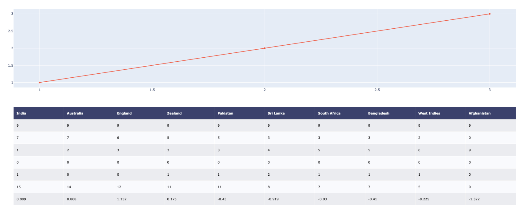
附上代码:
import plotly.graph_objs as go
import plotly.figure_factory as ff
import plotly_express as px

data = [[
                'India',
                'Australia',
                'England',
                'Zealand',
                'Pakistan',
                'Sri Lanka',
                'South Africa',
                'Bangladesh',
                'West Indies',
                'Afghanistan'
            ],
            [9,9,9,9,9,9,9,9,9,9],
            [7,7,6,5,5,3,3,3,2,0],
            [1,2,3,3,3,4,5,5,6,9],
            [0,0,0,0,0,0,0,0,0,0],
            [1,0,0,1,1,2,1,1,1,0],
            [15,14,12,11,11,8,7,7,5,0],
            [0.809,0.868,1.152,0.175,-0.43,-0.919,-0.03,-0.41,-0.225,-1.322]]

fig = ff.create_table(data)

fig.add_trace(go.Scatter(x=[1, 2, 3], y=[1, 2, 3],
                         xaxis='x2', yaxis='y2'))

fig.update_layout(yaxis_range=[-3,3])

fig.update_layout(
    height=800,
    margin={"t":75,"l":50},
    yaxis = {'domain': [0, .5]},
    xaxis2 = {'anchor': "y2"},
    yaxis2 = {'domain': [0.6, 1], 'anchor':'x2'}
)

fig.show()


 关于 LearnKu


推荐文章: