
uni-app实现手机后台管理|uniapp多端后台系统模板
6 / 1 / 创建于 4年前
 xiaoyan2015 的个人博客
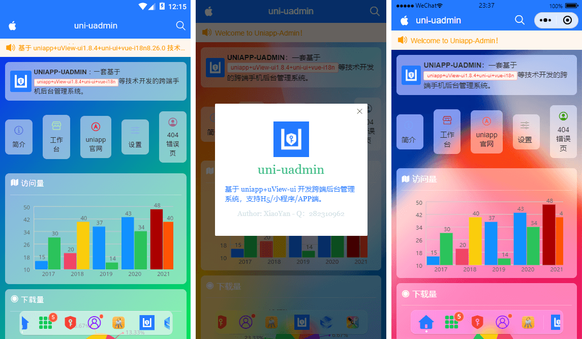
uniapp-uadmin 一款基于uniapp+uview-ui+echarts+mockjs等技术构建开发的跨平台手机后台管理系统项目。
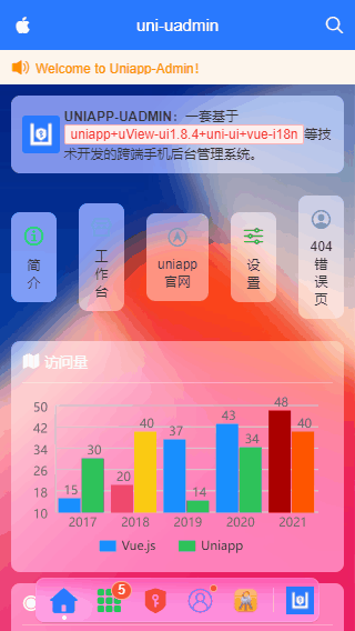
项目中每一个UI模块均是采用背景毛玻璃质感效果。支持动态全局换肤。
uni-uadmin 整合了图表、自定义表格、表单、瀑布流及富文本编辑器等业务模块,动态权限管理,错误页处理,支持编译至APP+H5+小程序端

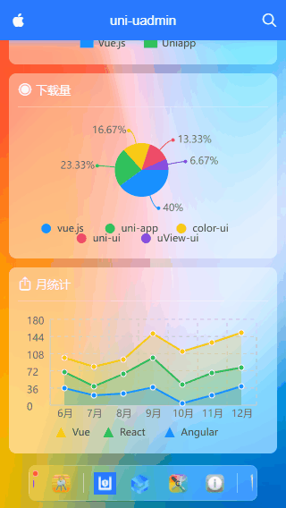
项目中的图表使用的是uniapp-echarts多端图表组件库。表格组件则是自己开发的一个uniapp自定义表格组件ua-table。
ua-dock 菜单支持左右滑动、自定义图标及标题文字+红点提示、点击选项返回索引,自定义背景色、自适应宽度。
<template>
    <view class="ua__dockbar">
        <scroll-view class="ua__dock-scroll ua__filter" :class="platform" scroll-x :style="{'background': bgcolor}">
            <view class="ua__dock-wrap">
                <!-- Tab菜单项 -->
                <block v-for="(item, index) in menu" :key="index">
                    <view v-if="item.type == 'divider'" class="ua__dock-divider"></view>
                    <view v-else class="ua__dock-item" :class="currentTabIndex == index ? 'cur' : ''" @click="switchTab(index, item)">
                        <text v-if="item.icon" class="iconfont nvuefont" :class="item.icon">{{item.icon}}</text>
                        <image v-if="item.img" :src="item.img" class="iconimg" :style="{'font-size': item.iconSize}" />
                        <text v-if="item.badge" class="ua__badge ua__dock-badge">{{item.badge}}</text>
                        <text v-if="item.dot" class="ua__badge-dot ua__dock-badgeDot"></text>
                    </view>
                </block>
            </view>
        </scroll-view>
    </view>
</template>
支持如下参数配置。
props: {
    // 当前索引
    current: { type: [Number, String], default: 0 },
    // 背景色
    bgcolor: { type: String, default: null },
    /**
     * [ 菜单选项 ]
        type    菜单类型 type: 'tab'支持uni.switchTab切换 type: 'divider'分割线
        path    菜单页面地址
        icon    菜单图标-iconfont图标
        img     菜单图片
        color    菜单图标颜色
        title    标题
        badge    圆点数字
        dot        小红点
     */
    menu: {
        type: Array,
        default: () => [
            /* Tab菜单 */
            {
                type: 'tab',
                path: '/pages/index/index',
                icon: `\ue619`,
                color: '#2979ff',
                title: '首页',
            },
            {
                type: 'tab',
                path: '/pages/component/index',
                icon: 'icon-component',
                color: '#17c956',
                title: '组件',
                badge: 5,
            },
            {
                type: 'tab',
                path: '/pages/permission/index',
                icon: 'icon-auth',
                color: '#f44336',
                title: '权限管理',
            },
            {
                type: 'tab',
                path: '/pages/setting/index',
                icon: 'icon-wo',
                color: '#8d1cff',
                title: '设置',
                dot: true,
            },
            {
                path: '/pages/error/404',
                img: require('@/static/mac/keychain.png'),
                title: '错误页面',
            },

            { type: 'divider' },

            /* Nav菜单 */
            {
                img: require('@/static/logo.png'),
                title: 'github',
            },
            {
                img: 'https://www.uviewui.com/common/logo.png',
                title: 'gitee',
            },
            {
                img: require('@/static/mac/colorsync.png'),
                title: '皮肤',
            },
            {
                img: require('@/static/mac/info.png'),
                title: '关于',
            },

            { type: 'divider' },

            {
                img: require('@/static/mac/bin.png'),
                title: '回收站',
                badge: 12,
            },
        ]
    },
}
项目中的公共模块采用的顶部自定义导航+内容区+底部dock
<template>
<view class="ua__pageview flexbox flex-col" :style="{'--SKIN': $store.state.skin, 'background': bgcolor, 'color': color}">
<slot name="header" />
<!-- //主容器 -->
<view class="ua__scrollview flex1">
<slot />
</view>
<!-- //底部 -->
<slot name="footer" />
<!-- //dock菜单 -->
<ua-dock v-if="dock && dock != 'false'" @click="handleDockClick" />
<!-- //函数式弹框 -->
<ua-popup ref="uapopup" />
<!-- //换肤弹框模板 -->
<ua-popup v-model="isVisibleSkin" position="right">
<Skin />
</ua-popup>
</view>
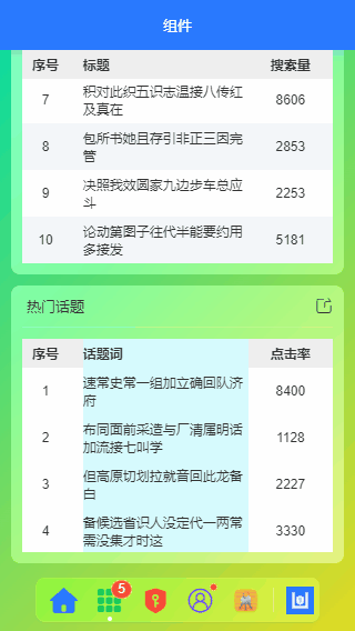
</template>ua-table 一款uniapp自定义表格组件,支持全选、单选,列宽/居中及可左右、上下滑动固定表头及列,支持点击行返回行数据,返回单选及多选行列数据,动态slot插槽等功能。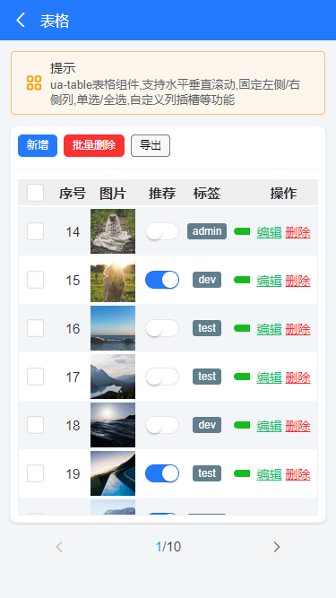
调用非常简单,通过如下方式即可快速创建一个uniapp表格。
<ua-table
    :columns="columns"
    headerBgColor="#eee"
    :headerBold="true"
    stripe
    padding="5px 0"
    :data="data.list"
    height="450rpx"
>
</ua-table>

<script>
import Mock from 'mockjs'

export default {
    data() {
        return {
            columns: [
                {type: 'index', align: 'center', width: 100, fixed: true}, // 索引序号
                {prop: 'title', label: '标题', align: 'left', width: '350'},
                {prop: 'num', label: '搜索量', align: 'center', width: 120},
            ],
            data: Mock.mock({
                total: 100,
                page: 1,
                pagesize: 10,
                'list|10': [
                    {
                        id: '@id()',
                        title: '@ctitle(10, 20)',
                        num: '@integer(1000,10000)'
                    }
                ]
            }),
        }
    }
}
</script>
还可以通过如下slot动态插槽方式,丰富表格内容。
<ua-table
    :columns="columns"
    headerBgColor="#eee"
    :headerBold="true"
    :stripe="true"
    :data="data.list"
    @row-click="handleRowClick"
    @select="handleCheck"
    height="750rpx"
    style="border:1px solid #eee"
>
    <template #default="{row, col, index}">
        <block v-if="col.slot == 'image'">
            <u-image :src="row.image" :lazy-load="true" height="100rpx" width="100rpx" @click="previewImage(row.image)" />
        </block>
        <block v-if="col.slot == 'switch'">
            <u-switch v-model="row.switch" inactive-color="#fff" :size="36"></u-switch>
        </block>
        <block v-if="col.slot == 'tags'">
            <u-tag :text="row.tags" bg-color="#607d8b" color="#fff" mode="dark" size="mini" />
        </block>
        <block v-if="col.slot == 'progress'">
            <u-line-progress active-color="#1fb925" :percent="row.progress" :show-percent="false" :height="16"></u-line-progress>
        </block>
        <block v-if="col.slot == 'btns'">
            <view class="ua__link success" @click.stop="handleFormEdit(row)">编辑</view>
            <view class="ua__link error" @click.stop="handleDel(row, index)">删除</view>
        </block>
    </template>
</ua-table>

<script>
import Mock from 'mockjs'

export default {
    data() {
        return {
            columns: [
                {type: 'selection', align: 'center', width: 80, fixed: true}, // 多选
                {type: 'index', align: 'center', width: 80, fixed: true}, // 索引序号
                {prop: 'author', label: '作者', align: 'center', width: 120},
                {prop: 'title', label: '标题', align: 'left', width: 350},
                {slot: 'image', label: '图片', align: 'center', width: 120},
                {slot: 'switch', label: '推荐', align: 'center', width: 100},
                {slot: 'tags', label: '标签', align: 'center', width: 100},
                {slot: 'progress', label: '热度', align: 'center', width: 150},
                {prop: 'date', label: '发布时间', align: 'left', width: 300}, // 时间
                {slot: 'btns', label: '操作', align: 'center', width: 150, fixed: 'right'}, // 操作
            ],
            data: Mock.mock({
                total: 100,
                page: 1,
                pagesize: 10,
                'list|30': [
                    {
                        id: '@id()',
                        author: '@cname()',
                        title: '@ctitle(10, 20)',
                        image: 'https://picsum.photos/400/400?random=' + '@guid()',
                        switch: '@boolean()',
                        'tags|1': ['admin', 'test', 'dev'],
                        progress: '@integer(30, 90)',
                        date: '@datetime()'
                    }
                ]
            }),
        }
    }
}
</script>
怎么样,是不是使用非常简单。不过由于uniapp及小程序的机制,自定义插槽功能还不是很完美,后续或许有些改进。
uniapp+uviewUI抖音短视频/直播实例
本作品采用《CC 协议》,转载必须注明作者和本文链接
本帖由系统于 4年前 自动加精


 关于 LearnKu


 粤公网安备 44030502004330号
推荐文章: