Vue+Echarts -- 大屏自适应缩放解决方案
0 / 0 / 创建于 3年前
 xiaobaibubai 的个人博客
Vue+Echarts – 大屏自适应缩放解决方案 => 使用transform:scale => 组件化抽离ScaleBox
1.创建一个组件SacleBox
<template>
    <div class="ScaleBox" ref="ScaleBox" :style="{ width: width + 'px', height: height + 'px', }" >
        <slot></slot>
    </div>
</template>
<script>
export default {
    name: "ScaleBox",
    props: {},
    data() {
        return {
            scale: 0,
            width: 1920,
            height: 1080,
        };
    },
    mounted() {
        this.setScale();
        window.addEventListener("resize", this.debounce(this.setScale));
        },
        methods: {
            getScale() {
            // 固定好16:9的宽高比,计算出最合适的缩放比
            const { width, height } = this;
            const wh = window.innerHeight / height;
            const ww = window.innerWidth / width;
            console.log(ww < wh ? ww : wh);
            return ww < wh ? ww : wh; },
            setScale() {
            // 获取到缩放比例,设置它
            this.scale = this.getScale();
            if (this.$refs.ScaleBox) {     this.$refs.ScaleBox.style.setProperty("--scale", this.scale);
                }
            },
            debounce(fn, delay) {
                const delays = delay || 500;
                let timer;
                return function () {
                    const th = this;
                    const args = arguments;
                    if (timer) {
                        clearTimeout(timer);
                    }
                    timer = setTimeout(function () {
                        timer = null; fn.apply(th, args);
                    }, delays);
                };
            },
        },
    };
</script>
<style lang="scss">
#ScaleBox {
    --scale: 1;
}
.ScaleBox {
    position: absolute;
    transform: scale(var(--scale)) translate(-50%, -50%);
    display: flex;
    flex-direction: column;
    transform-origin: 0 0;
    left: 50%;
    top: 50%;
    transition: 0.3s;
    z-index: 999;
    // background: rgba(255, 0, 0, 0.3); }
</style>
2.引用组件
export default {
  name: "bigScreen",
  components: {
    ScaleBox,
  },
  data() {
    return {
      // --------------------------------------------------------
    }
}
3.用ScaleBox组件包裹整个页面

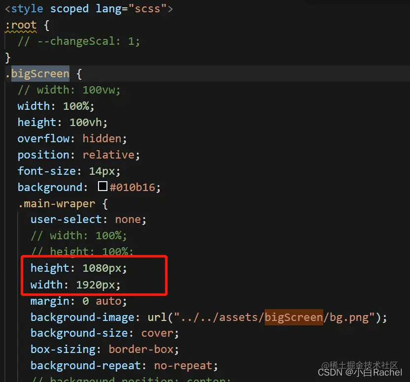
4.码自己页面
注意:
(1)使用px做单位,不使用rem
(2)ScaleBox内部页面元素最大的盒子按照19201080为容器 严格计算。所有宽高加起来为19201080
(3)最好不要使用百分比分配宽高
至此应该可以完成大屏自适应了,组件化之后也更好用,前期可以直接单独写页面,最后再加上ScaleBox即可,是非常方便简洁的方法。
作者:little问号Rachel
链接:juejin.cn/post/7090444388987305991
来源:稀土掘金
著作权归作者所有。商业转载请联系作者获得授权,非商业转载请注明出处。
本作品采用《CC 协议》,转载必须注明作者和本文链接


 关于 LearnKu


 粤公网安备 44030502004330号