
vue3.x自定义弹框组件|vue3.0移动端弹窗|vue3全局组件
1 / 2 / 创建于 5年前 /
 xiaoyan2015 的个人博客
介绍
之前有开发过一个vue2手机端弹层,今天分享的是Vue3版弹框组件。
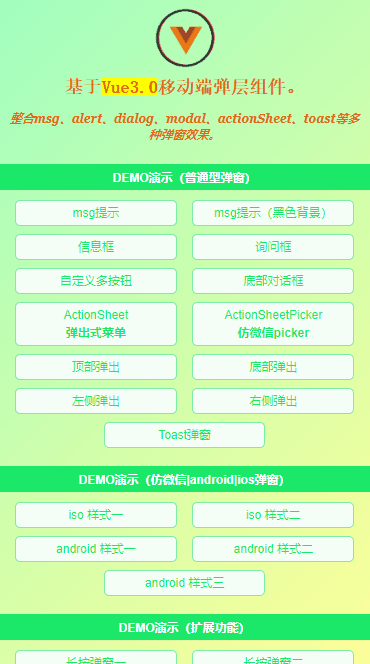
V3Popup 基于vue3.0开发的简易手机版弹框组件。支持6+弹框类型、7+动画效果、20+自定义参数配置。
在功能及效果上和之前vue2基本保持一致。
快速引入
通过如下方法即可快速引入v3popup弹框组件。
import { createApp } from 'vue'
import App from './App.vue'

// 引入弹窗组件v3popup
import V3Popup from './components/v3popup'

createApp(App).use(V3Popup).mount('#app')
参数配置
支持如下20+自定义参数任意搭配,实现各种弹窗效果。
|props参数|
v-model 是否显示弹框
title 标题
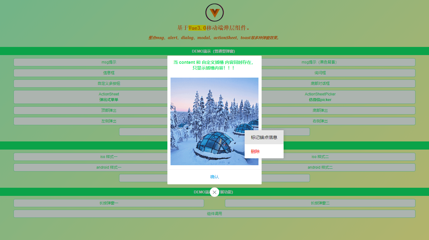
content 内容(支持String、带标签内容、自定义插槽内容)***如果content内容比较复杂,推荐使用标签式写法
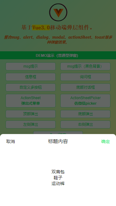
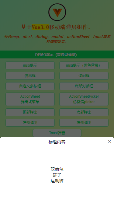
type 弹窗类型(toast | footer | actionsheet | actionsheetPicker | android | ios)
popupStyle 自定义弹窗样式
icon toast图标(loading | success | fail)
shade 是否显示遮罩层
shadeClose 是否点击遮罩时关闭弹窗
opacity 遮罩层透明度
round 是否显示圆角
xclose 是否显示关闭图标
xposition 关闭图标位置(left | right | top | bottom)
xcolor 关闭图标颜色
anim 弹窗动画(scaleIn | fadeIn | footer | fadeInUp | fadeInDown)
position 弹出位置(top | right | bottom | left)
follow 长按/右键弹窗(坐标点)
time 弹窗自动关闭秒数(1、2、3)
zIndex 弹窗层叠(默认8080)
teleport 指定挂载节点(默认是挂载组件标签位置,可通过teleport自定义挂载位置) teleport="body | #xxx | .xxx"
btns 弹窗按钮(参数:text|style|disabled|click)
++++++++++++++++++++++++++++++++++++++++++++++
|emit事件触发|
success 层弹出后回调(@success="xxx")
end 层销毁后回调(@end="xxx")
++++++++++++++++++++++++++++++++++++++++++++++
|event事件|
onSuccess 层打开回调事件
onEnd 层关闭回调事件
v3popup同样的支持函数式+组件式两种方式。
- 函数式
let $el = this.$v3popup({ title: '标题', content: '<div style='color:#f90;padding:10px;'>这里是内容信息!</div>', type: 'android', shadeClose: false, xclose: true, btns: [ {text: '取消', click: () => { $el.close(); }}, {text: '确认', style: 'color:#09f;', click: () => handleOK}, ], onSuccess: () => {}, onEnd: () => {} }) - 组件式
<v3-popup v-model="showMsg" anim="fadeIn" content="msg提示框测试(2s后窗口关闭)" shadeClose="false" time="2" /><v3-popup v-model="showConfirm" shadeClose="false" title="标题" xclose z-index="2021" content="<div style='color:#ff5252;padding:20px;'>确认框(这里是确认框提示信息,这里确认框提示信息,这里是确认框提示信息)</div>" :btns="[ {text: '取消', click: () => showConfirm=false}, {text: '确定', style: 'color:#09f;', click: handleInfo}, ]" />
编码开发
v3popup组件模板及核心逻辑处理部分。
<template>
    <div ref="elRef" v-show="opened" class="vui__popup" :class="{'vui__popup-closed': closeCls}" :id="id">
        <!-- //蒙层 -->
        <div v-if="JSON.parse(shade)" class="vui__overlay" @click="shadeClicked" :style="{opacity}"></div>
        <div class="vui__wrap">
            <div class="vui__wrap-section">
                <div class="vui__wrap-child" :class="['anim-'+anim, type&&'popupui__'+type, round&&'round', position]" :style="[popupStyle]">
                    <div v-if="title" class="vui__wrap-tit" v-html="title"></div>
                    <div v-if="type=='toast'&&icon" class="vui__toast-icon" :class="['vui__toast-'+icon]" v-html="toastIcon[icon]"></div>
                    <!-- 判断插槽是否存在 -->
                    <template v-if="$slots.content">
                        <div class="vui__wrap-cnt"><slot name="content" /></div>
                    </template>
                    <template v-else>
                        <div v-if="content" class="vui__wrap-cnt" v-html="content"></div>
                    </template>
                    <slot />
                    <div v-if="btns" class="vui__wrap-btns">
                        <span v-for="(btn, index) in btns" :key="index" class="btn" :style="btn.style" @click="btnClicked($event, index)" v-html="btn.text"></span>
                    </div>
                    <span v-if="xclose" class="vui__xclose" :class="xposition" :style="{'color': xcolor}" @click="close"></span>
                </div>
            </div>
        </div>
    </div>
</template>

/**
 * @Desc     Vue3.0自定义弹层V3Popup
 * @Time     andy by 2020-12
 * @About    Q:282310962  wx:xy190310
 */
<script>
    import { onMounted, ref, reactive, watch, toRefs, nextTick } from 'vue'
    let $index = 0, $locknum = 0, $timer = {}
    export default {
        props: {
            // 接收父组件v-model值,如果v-model:open,则这里需写open: {...}
            modelValue: { type: Boolean, default: false },
            // 标识符,相同ID共享一个实例
            id: {
                type: String, default: ''
            },
            title: String,
            content: String,
            type: String,
            popupStyle: String,
            icon: String,
            shade: { type: [Boolean, String], default: true },
            shadeClose: { type: [Boolean, String], default: true },
            opacity: { type: [Number, String], default: '' },
            round: Boolean,
            xclose: Boolean,
            xposition: { type: String, default: 'right' },
            xcolor: { type: String, default: '#333' },
            anim: { type: String, default: 'scaleIn' },
            position: String,
            follow: { type: Array, default: null },
            time: { type: [Number, String], default: 0 },
            zIndex: { type: [Number, String], default: '8080' },
            teleport: [String, Object],
            btns: {
                type: Array, default: null
            },
            onSuccess: { type: Function, default: null },
            onEnd: { type: Function, default: null },
        },
        emits: [
            'update:modelValue'
        ],
        setup(props, context) {
            const elRef = ref(null)

            const data = reactive({
                opened: false,
                closeCls: '',
                toastIcon: {
                    ...
                }
            })

            onMounted(() => {
                ...
            })

            // 监听弹层v-model
            watch(() => props.modelValue, (val) => {
                if(val) {
                    open()
                }else {
                    close()
                }
            })

            // 打开弹层
            const open = () => {
                if(data.opened) return
                data.opened = true
                typeof props.onSuccess === 'function' && props.onSuccess()

                const dom = elRef.value
                dom.style.zIndex = getZIndex() + 1

                ...

                // 倒计时
                if(props.time) {
                    $index++
                    // 避免重复操作
                    if($timer[$index] !== null) clearTimeout($timer[$index])
                    $timer[$index] = setTimeout(() => {
                        close()
                    }, parseInt(props.time) * 1000)
                }

                // 长按|右键菜单
                if(props.follow) {
                    ...
                }
            }

            // 关闭弹层
            const close = () => {
                if(!data.opened) return

                data.closeCls = true
                setTimeout(() => {
                    ...

                    context.emit('update:modelValue', false)
                    typeof props.onEnd === 'function' && props.onEnd()
                }, 200)
            }

            // 点击遮罩层
            const shadeClicked = () => {
                if(JSON.parse(props.shadeClose)) {
                    close()
                }
            }
            // 按钮事件
            const btnClicked = (e, index) => {
                let btn = props.btns[index];
                if(!btn.disabled) {
                    typeof btn.click === 'function' && btn.click(e)
                }
            }

            ...

            return {
                ...toRefs(data),
                elRef,
                close,
                shadeClicked,
                btnClicked,
            }
        }
    }
</script>
大家也可以根据以上模板或逻辑自行开发出一些想要的功能。
支持类似有赞的圆角弹框效果,可自定义弹出位置及关闭按钮位置。
vue3.0中支持createApp或createVNode render两种方式来扩展实例函数,将弹框组件挂载到body上。
let $inst
// 创建挂载实例
let createMount = (opts) => {
    const mountNode = document.createElement('div')
    document.body.appendChild(mountNode)

    const app = createApp(PopupConstructor, {
        ...opts, modelValue: true,
        remove() {
            app.unmount(mountNode)
            document.body.removeChild(mountNode)
        }
    })
    return app.mount(mountNode)
}
好了,基于vue3开发移动端弹框就分享这么多。感兴趣的可以自己去动手试一试哈。💪
electron+vue 仿微信客户端聊天|electron 仿微信界面|electron 聊天实例

本作品采用《CC 协议》,转载必须注明作者和本文链接


 关于 LearnKu


 粤公网安备 44030502004330号
推荐文章: